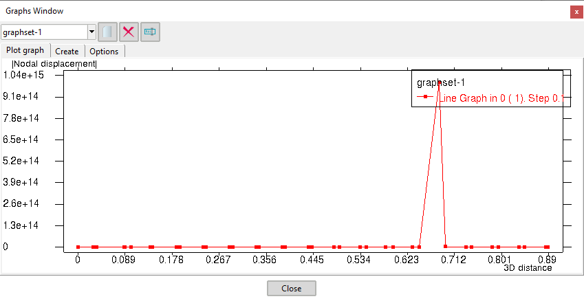
I wanted to change the format of the numbers along the axis on a graph. Unfortunately changing the results format (Preferences - Format) doesn’t have any influence of the format of these numbers. Is there any other command or possibility to adjust this format?
Because I don’t want to use exponential representation of a number (1,000,000 instead of 1E+06) along an axis.
Please, could you attach a zip with your graph and specify how do you exactly want to be shown?
(can export it to a .grf file for example clicking the contextual menu on the graphs window and select Export graph)
Thanks for the support.
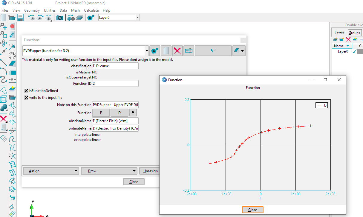
The immediate problem now is trying to define a function in the material data.
I am attaching a file of the problem I encountered. However, it is long and I have modified it by hand to make it shorter.
We are talking of different graph tools
I was talking about the postprocess graph window, implemented in C++ and OpenGL
and by the picture of your attached example you are talking of the auxiliary graph shown in classical problemtype questions, with ‘array fields’. This graphs is shown using the TkLib Plotchart scripting package.
I will study your example and provide some solution soon.
Graph drawing is not an easy task from a general point of view.
An example of a classic tool is xgraph, and I have recently been using matplotlib as a modern graphing tool.
In any case, users have to specify many configuration parameters to get the desired graphs.
I suppose that GiD is not a graph drawing tool that needs to specify many configuration parameters, which means that less useful and complicated features will be added to GiD. Then, at the moment, I ask GiD developers to limit the role of graph drawing to quick checking of calculated or input parameters. In the future, I hope GiD will implement high quality graph drawing without complex configuration parameters.
I have updated the related graph exponential format (automatic) available in GiD 16.0.4 official and GiD 16.1.3d developer. Both GiD versions are available for download just today:
About the graphs of Python ‘matplotlib’, It is possible to obtain some ‘similar graph’ with the TclLib Plotchart package.
Can see here some images Plotchart gallery
(off course matplotlib is easier to use and more modern)
In fact I think that the matplotlib Python module is drawing in a Tcl/Tk canvas using TkInter (that is a wrap of the Tk’s Tcl library to be called from Python)
A big new of GiD 16.1.2d developer is that is possible to run Python code from Tcl of GiD and vice-versa
This show an example just using matplotlib:
You can do a fast test writing this in the GiD lower entry
-np- GiD_Python_Exec {<paste_pyton_code_here>}
replacing <paste_pyton_code_here> by some example code of matplotlib like this
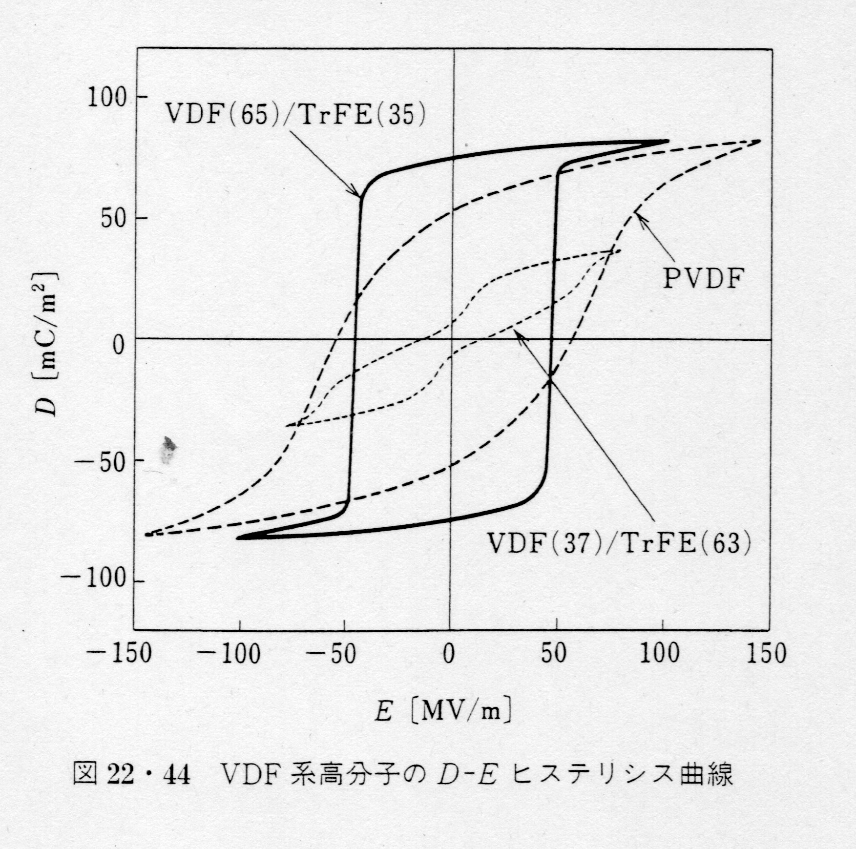
Thank you for all the good information. I will do some tests from now on. For those interested in my function, I attach a diagram from a Japanese book. The thickness of the ferroelectric material shown in the figure is used in very thin thickness, so the strength of the electric field becomes large even when the applied voltage is around 1 volt.